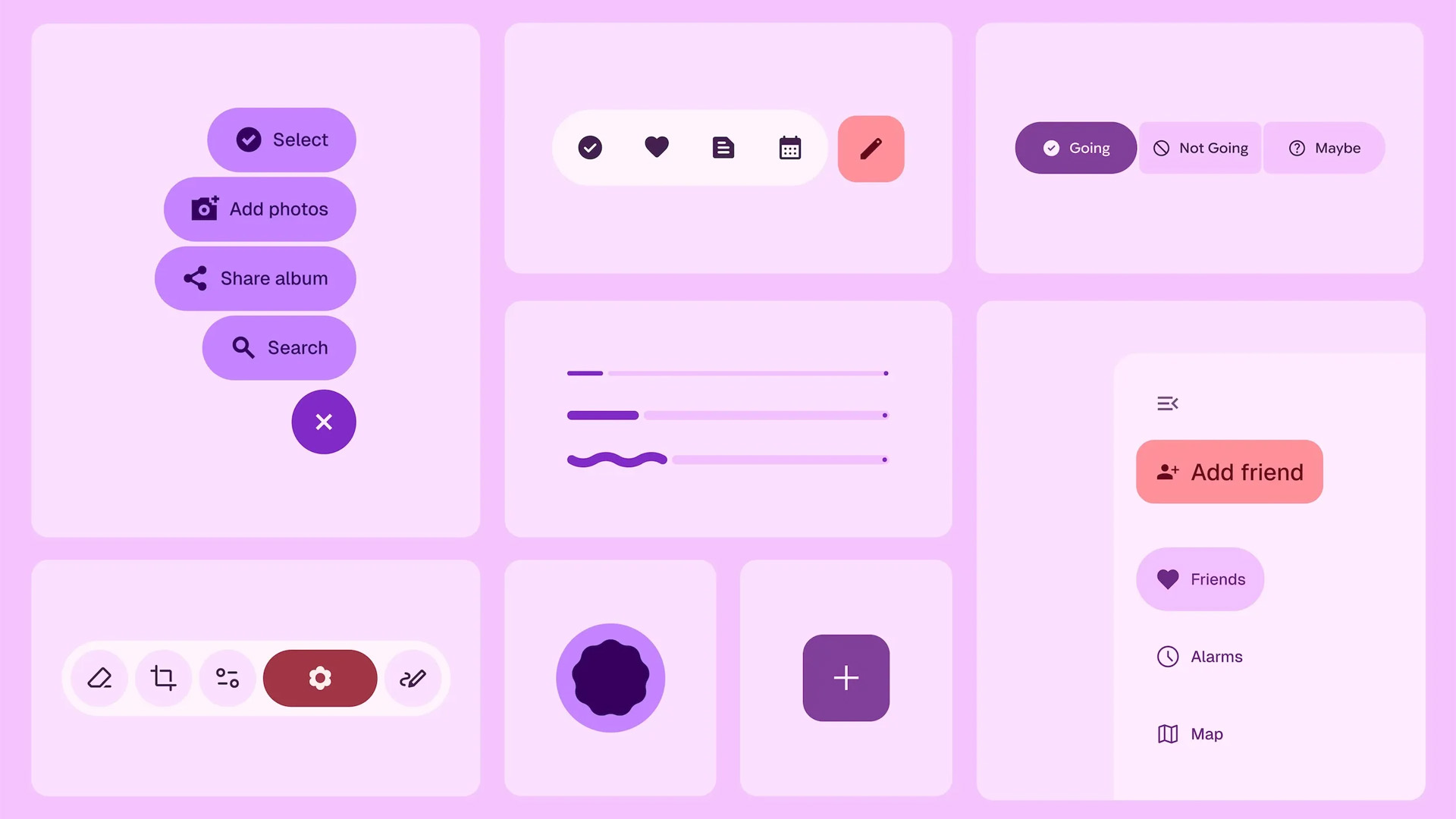
Google is about to introduce a fresh look for Android called “Material 3 Expressive” at their upcoming Google I/O developer conference on May 20-21, 2025. This news came to light when Google accidentally published a blog post that wasn’t supposed to be released yet.
This new design approach aims to make Android interfaces more emotional and engaging rather than just clean and functional. According to the leaked information, Google has spent the last three years developing this update, making it “the most-researched enhancement to Google’s design system, ever”.
What Makes Material 3 Expressive Special?
The new design focuses on creating more visually appealing interfaces that connect with users emotionally. It uses bold shapes, vibrant colors, and thoughtful layouts to highlight important elements on the screen. This isn’t a complete overhaul of Android’s look – it’s more of an evolution of the current Material 3 (also known as Material You) that was introduced back in 2021.
Google’s research shows some impressive results:
- Users could find key elements up to 4 times faster with the new design
- The design creates a “level playing field” for users of all ages, helping older adults (over 45) identify interface elements as quickly as younger users
- About 80% of Gen Z users (“Zoomers”) particularly liked the new design
One interesting new element is a “floating toolbar” – a pill-shaped bottom bar that doesn’t stretch across the entire screen width, allowing users to see a bit of the background behind it.
Related articles you may find interesting
Extensive Research Behind the Design
Google didn’t just make these changes on a whim. The company conducted:
- 46 separate research studies
- Hundreds of sample designs
- Feedback from over 18,000 participants worldwide
Their research methods were thorough, including eye tracking to see where users looked, surveys to measure emotional reactions, experiments to gather preferences, and usability tests to see how quickly people could navigate interfaces.
What to Expect?
While we’ll get the full details at Google I/O later this month, some elements that might appear in the new design include:
- Brighter colors and bolder shapes
- Larger, more noticeable buttons for important actions
- A slimmer bottom navigation bar
- Possibly different font sizes and more white space
The design will likely be fully implemented in Android 16, expected later in 2025, though some elements are already appearing in beta versions.
For developers, Google plans to share files and alpha code at the I/O conference so they can start experimenting with the new design elements before the public release.
This update reflects Google’s understanding that good design isn’t just about functionality – it’s also about creating interfaces that feel good to use and create emotional connections with users.

